Flex Box
Play With Flexbox...

Why Flex Box in CSS...?
Flexbox is one kind of CSS that is very powerful and unique to set items or boxes in a row or a column manner. Also without this CSS layout, it might be hard to set all items in a row or a column. Well, it designs our webpage very attractive. Moreover, Item flex expands or shrinks in the CSS layout. Some flexbox properties are used to set our items very nicely.
Properties:
Flex- Direction:
Well, when we are using this flex direction at that time we can set items as either row or column. Also, it has some extra direction properties such as row-reverse, and column-reverse according to the direction.
Output:

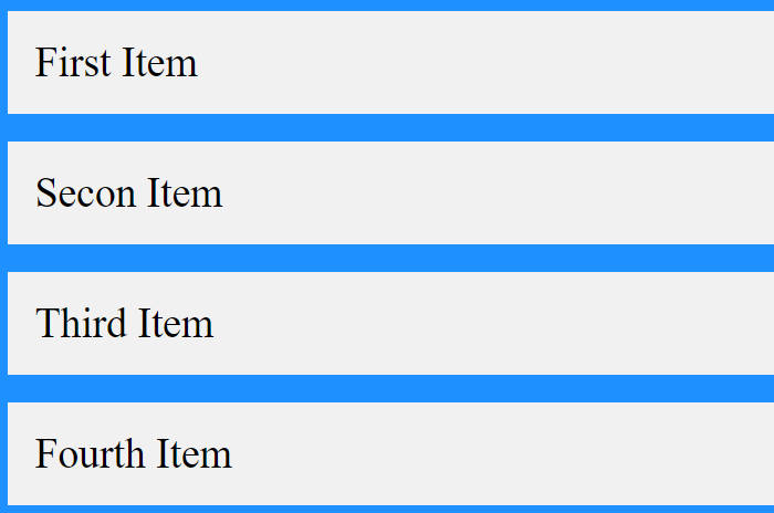
By default, we can see our item in a rowing manner.
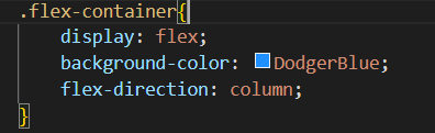
Flex-direction: column:
Output:
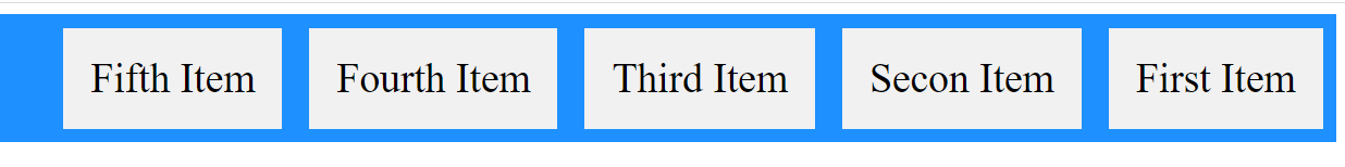
Row-Reverse:

Output:
You can do the same task in column reverse as well using the column reverse property.
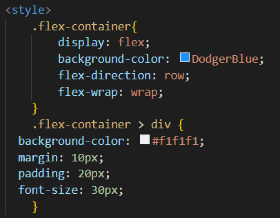
Flex-Wrap:
This property helps to wrap or shrink your item. Well, it depends on your window size. When you do your browser in small size at that time your all items shrink according to the size or when your browser is the normal screen so it looks like all items are in one line. It has no wrap, wrap reverse
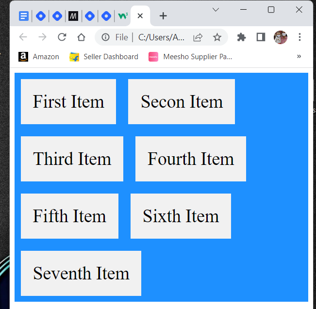
First output with normal screen:

Second with a small screen:
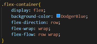
Flex-Flow: I
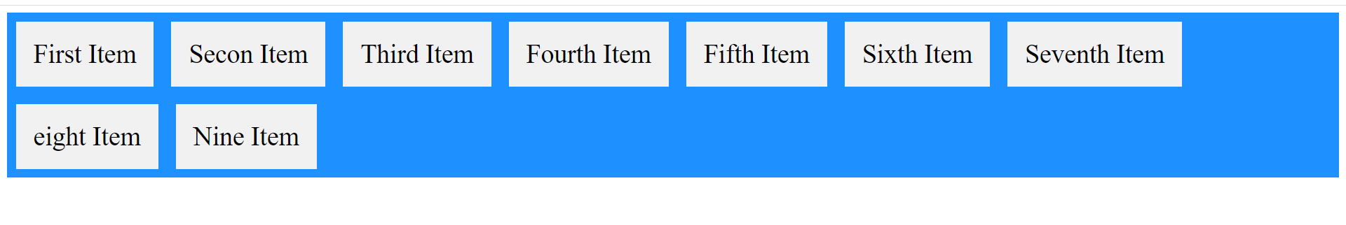
Row wrap: it wraps your all item in a rowing manner at the same screen(normal screen on your window). You can observe the item eight and nine.
You can do the same task in column wrap flex-flow.
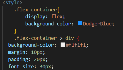
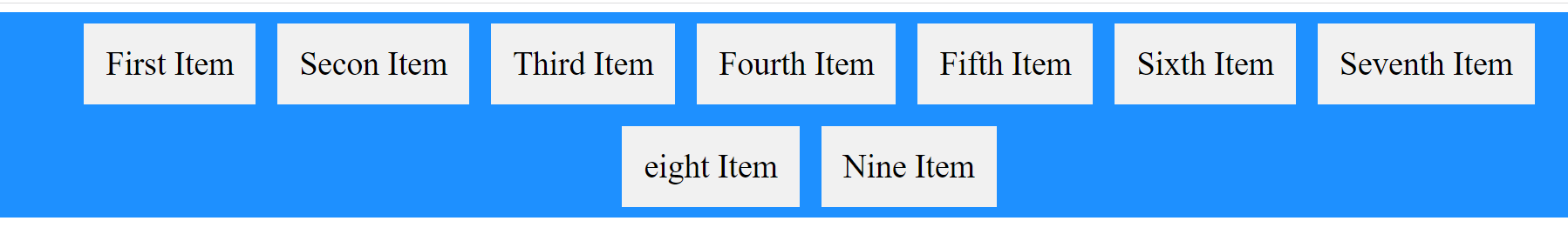
- Justify-content:
It helps to align flex in row items. Well, it has a center, flex-start, flex-end, and space-around properties and space-between. I focus on justify-content in the center and flex-end. It is the same with the rest of the property. You need to only apply it.
Output:
Flex-end property


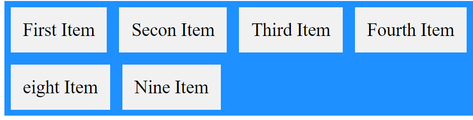
- Align-item property:
Well, this is the same as justify-content when you see it the first time as output. But if you see it on display so there is a difference between align-item and justify-content. When you apply align item so all your items should be centered on a display screen(middle of the screen) or when you apply justify-content so it should be centered as normally. It has an align-item center, flex-start, flex-end, starch, baseline
Output:
To pen down, I hope you enjoy a lot in this play with the flex box article. Also, you can learn something new from this article. If you want to learn more so I put a link as a reference so you can refer and try to learn. I attach also have one link which is the game flexbox froggy. so you can learn while playing.
References: https://www.w3schools.com/css/css3_flexbox_items.asp https://flexboxfroggy.com/


